


Excel can be challenging, despite its widespread use, especially when customizing certain features like the X-Axis. Whether you're a student, a business owner, or simply someone who enjoys working with graphs and charts, knowing how to manipulate the X-Axis is crucial for effective data presentation.
In this article, we'll guide you through changing the X-Axis in Excel, and adjusting the axis range and intervals. Gain the confidence to modify and enhance your data visualization skills with Excel.
Table of Contents
- Change the text of the labels
- Change the format of text and numbers in labels
- Change the scale of the horizontal (category) axis in a chart
- How to Edit the X-Axis
- How to Change X-Axis Intervals
- FAQs
- Final Thoughts
Change the text of the labels
To change the text of the labels in Excel, follow these steps:
- Click on each cell in the worksheet that contains the label text you want to change.
- Type the desired text in each cell and press Enter. This will update the labels in the chart accordingly.
If you want to create custom labels that are independent of the worksheet data, you can follow these additional steps:
-
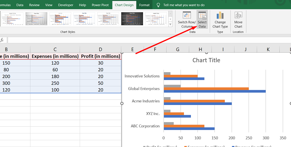
Right-click on the category labels you want to change in the chart and select "Select Data."
-
In the "Select Data Source" dialog box, find the "Horizontal (Category) Axis Labels" box and click on the "Edit" button.
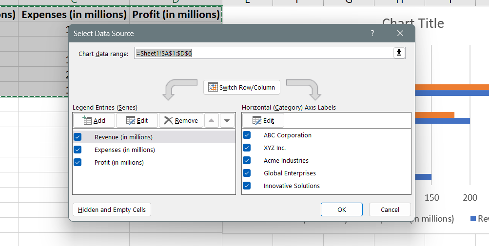
- In the "Axis label range" box, enter the custom labels you want to use, separated by commas. For example, if you want to use labels like "Quarter 1," "Quarter 2," "Quarter 3," and "Quarter 4," you would enter: "Quarter 1,Quarter 2,Quarter 3,Quarter 4."
Change the format of text and numbers in labels
To change the format of text and numbers in labels in Excel, follow these steps:
To change the format of text in category axis labels:
- Right-click on the category axis labels in the chart you want to format.
-
Select "Font" from the menu that appears.

-
In the Font dialog box, navigate to the Font tab and choose your desired formatting options.

- Additionally, you can adjust the spacing of the characters by going to the Character Spacing tab and selecting the desired spacing options.
To change the format of numbers on the value axis:
- Right-click on the value axis labels in the chart you want to format.
-
Choose "Format Axis" from the menu.

- In the Format Axis pane that appears on the right, click on the "Number" option.
-
If the Number section is not visible, ensure you have selected a value axis (usually the vertical axis on the left).
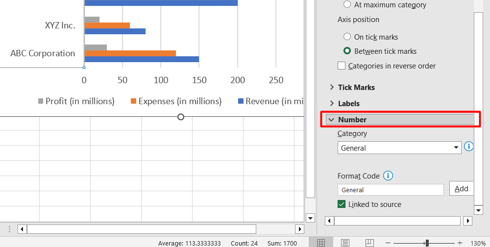
- Customize the number format by selecting the desired options.
- You can enter the value in the Decimal places box if you need to specify the number of decimal places.
- Check the Linked to source box if you want the numbers to remain linked to the worksheet cells.
Change the scale of the horizontal (category) axis in a chart
To change the scale of the horizontal (category) axis in a chart in Excel, follow these steps:
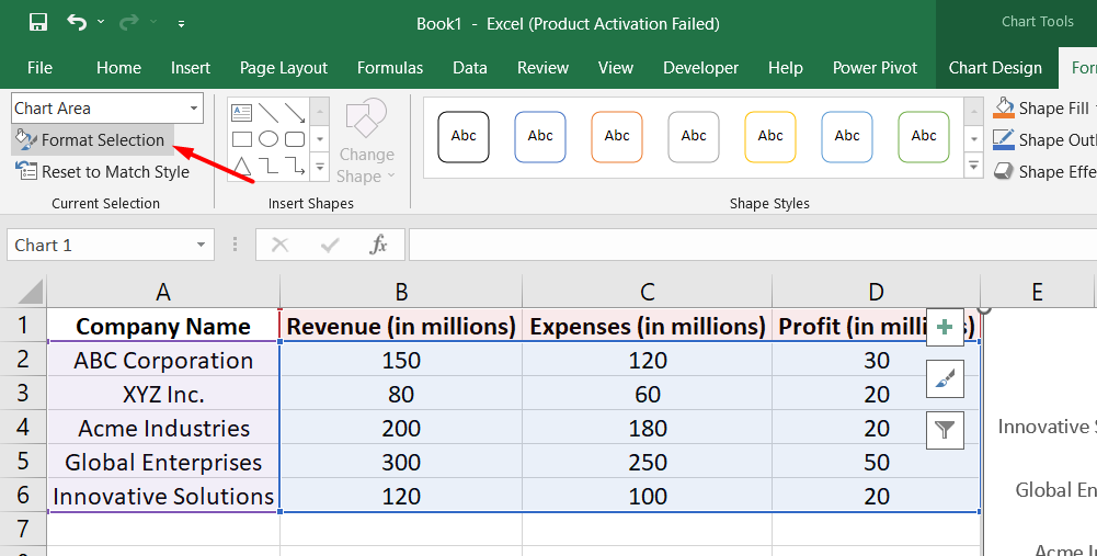
- Click anywhere on the chart to select it. This will display the Chart Tools with the Design and Format tabs.
-
Go to the Format tab and locate the Current Selection group. Click the arrow in the box at the top, and then select "Horizontal (Category) Axis."

-
Still on the Format tab, click "Format Selection" in the Current Selection group.
In the Format Axis pane that appears, you can make the following adjustments:
- Expand Axis Options and select the "Categories in reverse order" check box to reverse the order of categories.
- To change the axis type to a text or date axis, expand Axis Options and under Axis Type, choose either "Text axis" or "Date axis."
- To change the point where the vertical (value) axis crosses the horizontal (category) axis, expand Axis Options and under Vertical axis crosses, select "At category number" and enter the desired number or select "At maximum category" to cross the axis after the last category.
-
Expand Tick Marks and enter the desired number in the "Interval between tick marks" box to change the interval between tick marks.
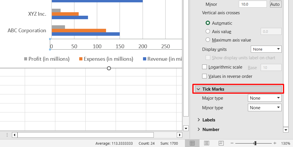
- To change the placement of the axis tick marks, expand Tick Marks and select the desired options in the Major type and Minor type boxes.
- To change the interval between axis labels, expand Labels and under Interval between labels, select "Specify interval unit" and enter the desired number.
- To change the placement of axis labels, expand Labels and enter the desired number in the Distance from the axis box.
How to Edit the X-Axis
To edit the X-axis in Excel, you can follow these steps:
- Open the Excel file that contains the chart you want to modify.
- Click on the graph that has the X-axis you want to edit.
- Look for the Chart Tools menu that appears when you select the chart.
- Click on the "Format" option from the Chart Tools menu.
- Locate and select "Format Selection," typically found under the "File" section at the top of the screen.
- In the open Format Axis pane, click "Axis Options" to access more editing options.
- If you want to change how categories are numbered, \select "Values in reverse order" under Axis Options.
- To adjust the merging point of the X and Y axes, select Axis Options and modify the maximum value. This can help change the interval of tick marks and alter the spacing in your chart.
How to Change X-Axis Intervals
To change the intervals of the X-axis in Excel, follow these steps:
For a Text-Based X-Axis:
- Open the Excel file containing your graph.
- Select the graph by clicking on it.
- Right-click on the Horizontal Axis and choose "Format Axis..." from the menu that appears.
- In the Format Axis pane, select "Axis Options" and click "Labels."
- Under "Interval between labels," choose the radio button next to "Specify interval unit" and click on the text box next to it.
- Enter your desired interval in the box. You can specify the number of categories you want between each label.
- Once you've entered the desired interval, close the window. Excel will save the changes you made.
FAQs
How do I change the X axis value in sheets?
To change the X axis value in Google Sheets, you can click on the chart, go to "Customize," and then modify the X axis settings.
How do I change horizontal values in Excel?
To change horizontal values in Excel, you need to select the chart, click on the "Select Data" option, and then edit the values under the Horizontal (Category) Axis Labels.
Why is my X axis wrong in Excel?
If your X axis is wrong in Excel, it could be due to incorrect data selection for the chart, formatting issues, or mismatched data types. Check your data and formatting settings to ensure accuracy.
How do I reset the axis in Excel?
To reset the axis in Excel, right-click on the axis you want to reset, choose "Format Axis," and then select the desired options under the Axis Options tab. Alternatively, you can click the Reset button to revert to the default settings.
How do I fix the axis range in Excel?
To fix the axis range in Excel, right-click on the axis, select "Format Axis," and specify the desired minimum and maximum values under the Axis Options tab.
Final Thoughts
Changing X-axis values in Excel is essential for creating accurate and meaningful charts and graphs. By modifying the X-axis values, you can better represent your data and convey the intended message.
Whether you need to adjust the labels, format the text and numbers, or alter the scale and intervals, Excel provides a range of options to customize the X-axis. It is important to understand the steps involved in making these changes, such as selecting the axis, accessing the formatting options, and applying the desired modifications.
By mastering these techniques, you can create professional-looking charts that effectively communicate your data insights to others.
One more thing
If you have a second, please share this article on your socials; someone else may benefit too.
Subscribe to our newsletter and be the first to read our future articles, reviews, and blog post right in your email inbox. We also offer deals, promotions, and updates on our products and share them via email. You won’t miss one.
Related articles
» How to Change Series Name in Excel
» How To Change the Default Browser on Windows 11
» How to Change the Windows 11 Widgets Language