

Adding Excel axis labels to your charts in Microsoft Excel can greatly enhance their clarity and understandability.
In this article, we will guide you through adding axis labels in Excel. We've got you covered whether you need to add data labels, change vertical axis labels, or set axis titles for better chart comprehension.
Table of Contents
- What are axis labels in Excel charts?
- Add a chart title
- Remove a chart title
- Change the text of the labels
- Change the format of text and numbers in labels
- FAQs
- Final Thoughts
What are axis labels in Excel charts?
Axis labels in Excel charts provide additional information about the chart's axes, helping to clarify the data being represented. By default, Excel does not display axis labels, so they need to be added manually.
Axis labels serve as titles or descriptions for the chart's horizontal (X-axis) and vertical (Y-axis) axes. They provide context and help the viewer understand what the axes represent. For example, in a chart displaying revenue data across different departments, the horizontal axis label may indicate the departments, while the vertical axis label may indicate the revenue amounts.
Including axis labels enhances the readability and interpretability of the chart, ensuring that viewers can accurately understand and analyze the presented data. Axis labels can be customized with specific titles or descriptions relevant to the data and the chart's purpose.
Adding clear and descriptive axis labels in Excel charts is crucial for effective data visualization and communication, as they provide essential information about the data axes and aid in conveying the intended message of the chart.
Add a chart title
To add a chart title in Excel, follow these steps:
- In the chart, locate the "Chart Title" box, typically positioned above the chart area.
- Click inside the "Chart Title" box and type in the desired title for your chart.
- Select the "+" sign at the chart's top-right corner to further customize the chart title. This will open a drop-down menu.
- Within the drop-down menu, click on the arrow next to "Chart Title." This will display additional options for chart title placement.
-
Choose "Centered Overlay" to position the title over the chart, making it visually prominent. Alternatively, select "More Options" for additional formatting choices.

- If you wish to format the chart title, right-click on it and select the "Format Chart Title" option. This will provide various formatting options such as adjusting the fill color, outline, font style, etc.
Remove a chart title
To remove a chart title in Excel, follow these steps:
- Click on the chart from which you want to remove the title.
- Locate the "+" sign at the chart's top-right corner. Click on it to access additional chart options.
-
Within the drop-down menu, look for the checkbox next to "Chart Title." By default, this checkbox is checked, indicating the presence of a chart title.
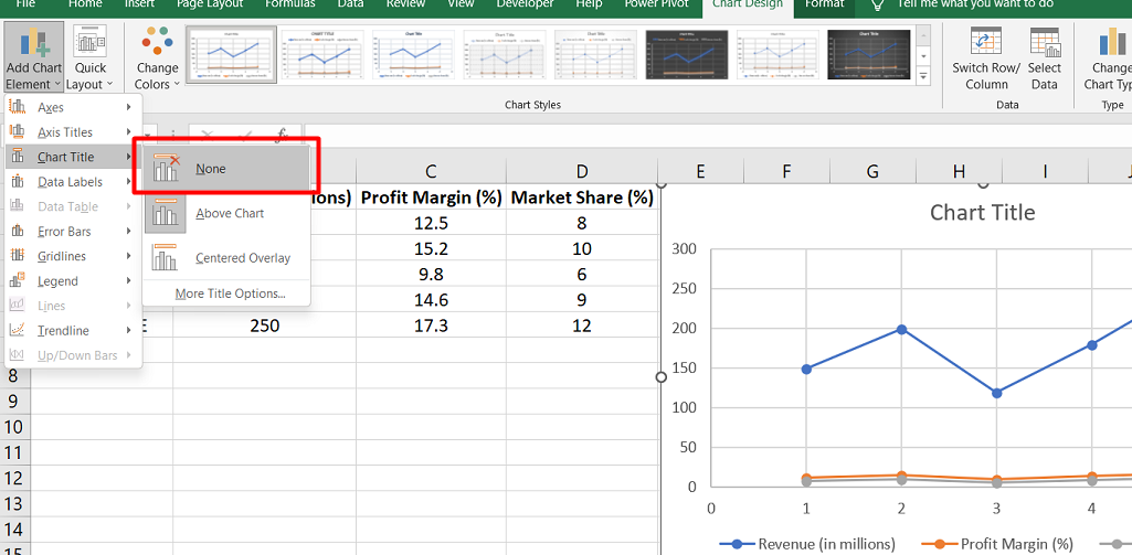
- Uncheck the checkbox next to "Chart Title." This action will remove the chart title from the selected chart.
Following these simple steps, you can easily remove a chart title in Excel. This may be useful if you decide that the chart title is unnecessary or if you want to change the chart's appearance by removing the title.
Change the text of the labels
To change the text of labels in Excel, you can follow these steps:
For modifying existing label text:
- Click on each cell in the worksheet that contains the label text you want to change.
- Type the desired text directly into each cell and press Enter. The labels in the chart will automatically update to reflect the changes made in the cells.
This method allows you to update the label text by editing the corresponding cells in the worksheet.
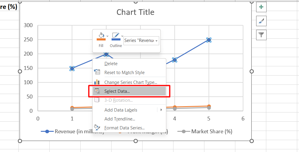
For creating custom labels independent of the worksheet data:
-
Right-click on the category labels you want to change within the chart and select "Select Data."
-
In the "Select Data Source" dialog box, locate the "Horizontal (Category) Axis Labels" box and click on the "Edit" button.
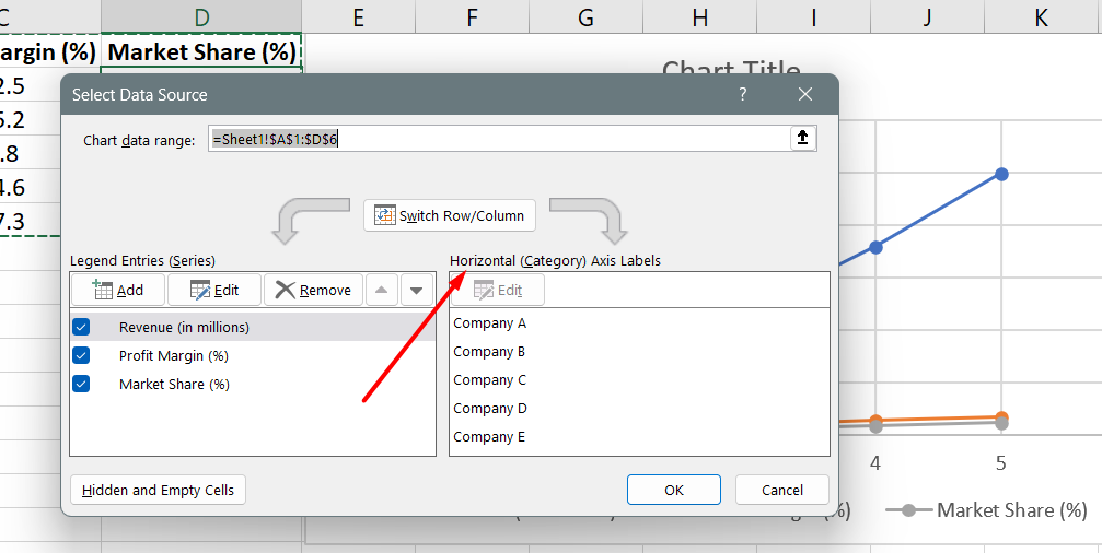
- In the "Axis label range" box, enter the custom labels you want to use, separated by commas. For example, if you want to set labels as "Quarter 1," "Quarter 2," "Quarter 3," and "Quarter 4," you would enter: Quarter 1,Quarter 2,Quarter 3,Quarter 4.
This method allows you to specify custom labels directly within the chart, independent of the actual data in the worksheet.
Change the format of text and numbers in labels
To change the format of text and numbers in labels in Excel, follow these steps:
For formatting text in category axis labels:
- Right-click on the category axis labels you want to format within the chart.
-
Click on "Font" to open the Font settings.
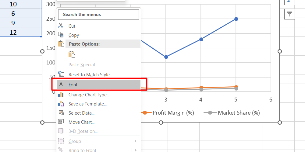
- On the Font tab, choose the desired formatting options for the text, such as font style, size, color, and more.
You can also adjust the spacing options for the text on the Character Spacing tab if needed.
These steps allow you to customize the appearance of the text in the category axis labels.
For formatting numbers on the value axis:
- Right-click on the value axis labels you want to format.
-
Click on "Format Axis" to open the Format Axis pane.

- In the Format Axis pane, click on "Number."
- Choose the desired number format options for the values, such as currency, percentage, date, or custom formats.
- Specify the number of decimal places in the Decimal places box.
- Check the "Linked to source" box to ensure the numbers remain linked to the source worksheet cells.
FAQs
How do I add data labels in Excel?
To add data labels in Excel, select the data series, right-click, choose "Add Data Labels," and then customize the labels as needed.
How do I change vertical axis labels in Excel?
To change vertical axis labels in Excel, select the chart, right-click on the vertical axis, choose "Format Axis," and then modify the axis labels in the Format Axis pane.
How do I add vertical and horizontal axis labels in Excel?
To add vertical and horizontal axis labels in Excel, select the chart, click on the "Chart Elements" button, check the "Axis Titles" box, and enter the desired labels for both the vertical and horizontal axes.
How do I set axis in Excel?
To set the axis in Excel, select the chart, right-click on the axis you want to modify, choose "Format Axis," and then adjust the axis options such as minimum and maximum values, tick marks, and other settings in the Format Axis pane.
How do you add vertical and horizontal axis labels?
To add vertical and horizontal axis labels in Excel, select the chart, click on the "Chart Elements" button, check the "Axis Titles" box, and enter the desired labels for both the vertical and horizontal axes.
Final Thoughts
Adding axis labels in Microsoft Excel is a simple yet powerful way to enhance the clarity and understanding of your charts. By providing descriptive titles for the horizontal and vertical axes, you can provide crucial context to your data visualization.
To add axis labels, select the chart and use the "Chart Elements" button to enable axis titles. From there, you can customize the labels by entering the desired text.
Additionally, you can change the format of the labels, such as font style and size, to further improve readability. Axis labels play a significant role in improving the effectiveness of your charts by guiding viewers and facilitating accurate data interpretation.
One more thing
If you have a second, please share this article on your socials; someone else may benefit too.
Subscribe to our newsletter and be the first to read our future articles, reviews, and blog post right in your email inbox. We also offer deals, promotions, and updates on our products and share them via email. You won’t miss one.
Related articles
» Unable to Add or Create New Cells in Excel
» Excel Header and Footer - How to Add Headers and Footers in Excel
» Excel Add-Ins: Enhance Functionality and Productivity