We will explore the benefits of using Excel tables and offer tips for creating and formatting them effectively.
You can easily track and manage large sets of data by utilizing Excel tables. Tables allow you to quickly sort and filter data based on specific criteria, making analyzing and identifying trends easier.
This article will walk you through creating and formatting tables and offer tips for effectively analyzing your data.
Let's dive in!
Excel Charts for Effective Data Analysis
Charts are a helpful tool for presenting data more understandably. Excel offers various chart types that can help organize and analyze data.
A chart visually represents information using symbols like bars or lines to show data. It helps summarize large data sets so that it's easier to understand and analyze.
Excel charts allow users to focus on the significant parts of the report by filtering out unnecessary data. The chart highlights the most important bits of information, making it easier to comprehend the story.
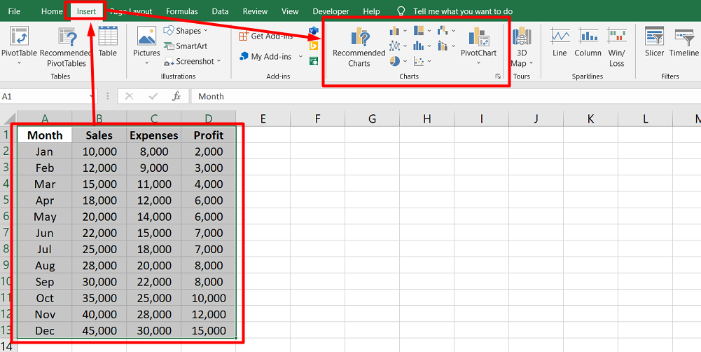
Creating a chart in Excel is simple:
- Select the data range you want to include in the chart.
- Navigate to the Insert tab, click on the Charts command group,
- Select the desired chart type from the icons.
- Make any necessary modifications to the chart, like adding titles or adjusting the scale.
Some of Excel's most common chart types are:
- Pie charts
- Line charts
- Column charts
- Bar charts
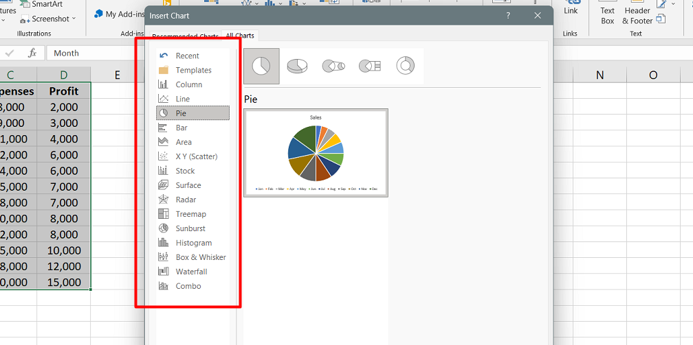
Each chart type has a unique way of displaying data, making it easier to analyze and understand.
With Excel charts, users can effectively convey data to others and make informed decisions based on the information presented.
Tips for Effective Data Analysis with Tables
It's important to start with clean and organized data when using Analyze Data in Excel. This means formatting your data as an Excel table by selecting your data and pressing Ctrl+T.
Headers are also important - they should be unique and descriptive labels for each column. It's best to avoid double rows of headers or merged cells, as this can confuse the program.
If you have more complex data, like cross-tabs or multiple rows of headers, you can use Power Query to help you organize it. Power Query can convert this data into a table format that Analyze Data can work with.
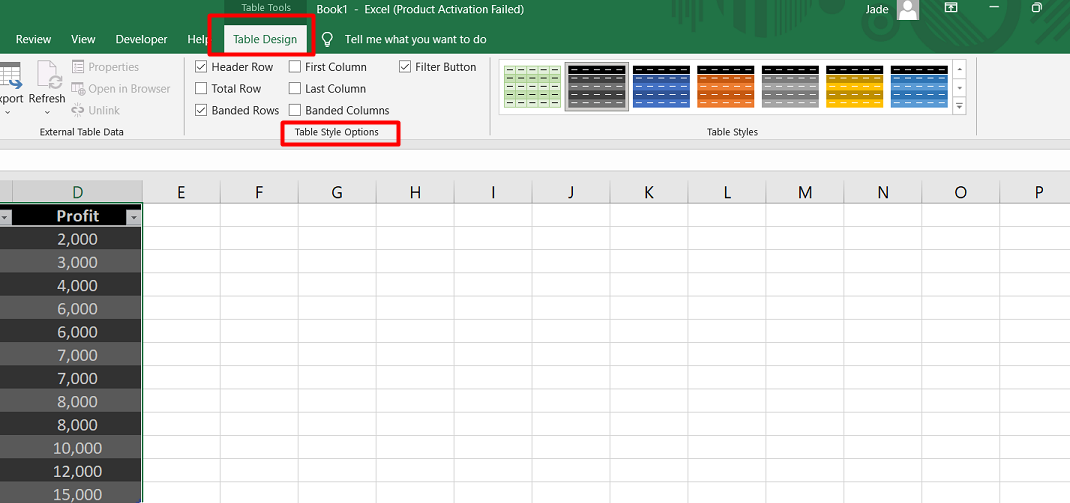
Formatting Excel Tables with Table Styles
Table styles are a way to add colors, fonts, borders, and shading to tables in Excel. There are 60 different options available in the Table Styles gallery, and they are divided into Light, Medium, and Dark groups based on the intensity of the colors used.
To apply a table style to a table, you can either use the:
-
Format As Table option in the Styles group on the Home tab
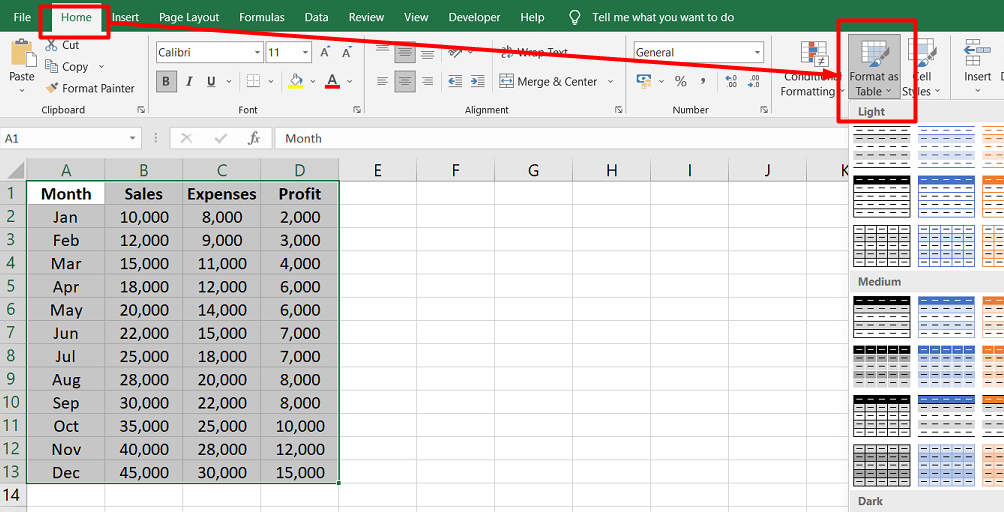
- or click the arrow in the Table Styles gallery in the Table Tools Design tab
To use the Format As Table option:
- Select the range of cells that you want to turn into a table
-
Click on the Format As Table button
- Choose the style you want to apply from the gallery that appears.
This will format the table with the selected style.
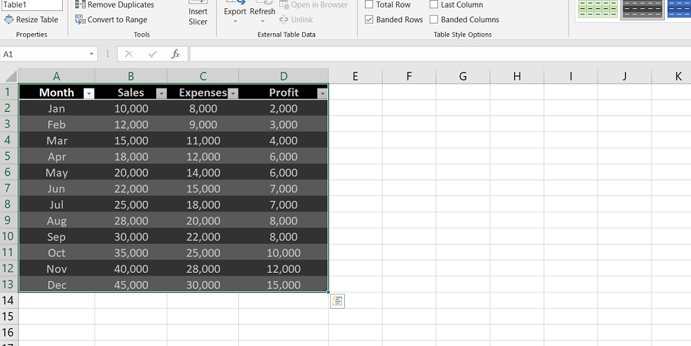
Alternatively, you can use the Table Styles gallery on the Table Tools Design tab. Click on the arrow to see the available options, and choose the one you want to use.
This will apply the style to the table.
Fine-tuning Table Styles in Excel
When creating tables in Excel, it's important to make them easy to read. One way to do this is by using table styles.
Excel has 60 different table styles, which you can access by clicking on the Table Styles gallery. These styles include different colors, fonts, borders, and shading that can be applied to your table to make it look more professional and easy to read.
Additionally, you can fine-tune your table style using the Table Style Options group. This allows you to customize settings such as banded rows and columns, header rows, and total rows.
For example:
You can choose to alternate background colors between rows or columns to make the table easier to read. You can also add a row at the bottom of the table to show the total for each column.
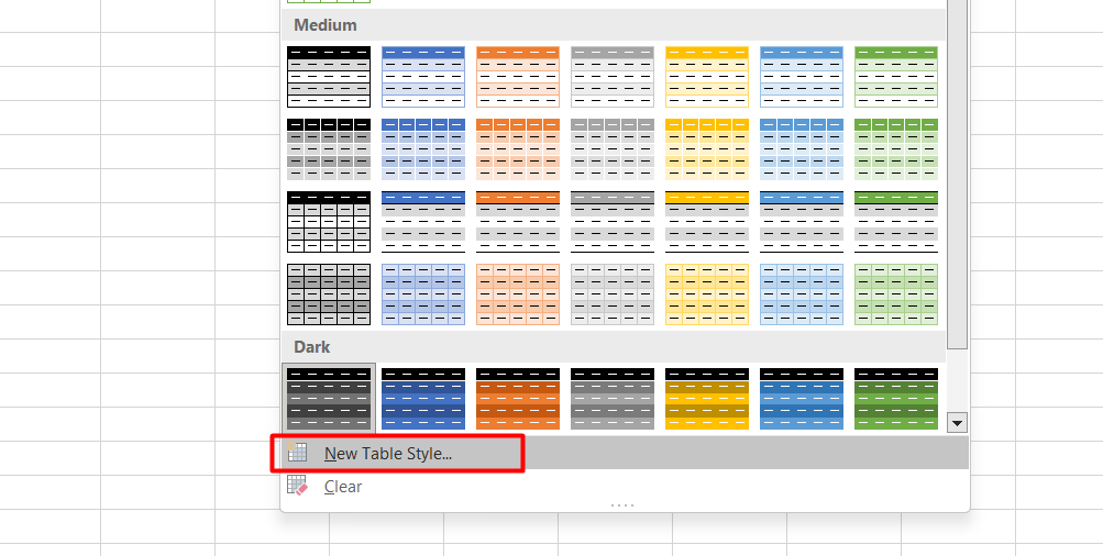
If you can't find a table style that suits your needs, you can create your own by clicking on the New Table Style link. This will allow you to customize the properties of each part of the table individually, giving you even more control over how your table looks.
With all these options, you can create a table that looks exactly like you want.
Excel Table Styles Troubleshooting
Have you ever customized a table style in Excel and found that the fonts and colors didn't behave as you expected? Well, here's why: When you create a custom table style, you can change the font style and color, not the font and font size.
That's because the current theme in Excel determines these elements. If you want to use a different font or font size, you have to apply the formatting manually to the entire table.
Similarly, if you choose a background or fill color from the Fill tab, the color may change when you change the theme. To ensure that a specific color remains unchanged, you must define the color manually using the More Colors option.
Excel's default table styles are designed to work with its themes. If you want to customize fonts and colors, be prepared to do some manual formatting.
How to Expand or Shrink a Table in Excel
A table in Excel is a useful tool for organizing data. You can add or remove rows and columns to the table as needed. Here's how to expand or shrink a table:
To add a row to the table:
- Click on the cell in the lower-right corner of the table range
- Press the Tab key.
Excel will add a new row to the table, and the active cell will move to the first column in the new row.
To expand the table manually:
- Look for a small triangular handle in the lower-right corner of the table.
- Click and drag this handle down to add rows to the table or to the right to add columns.
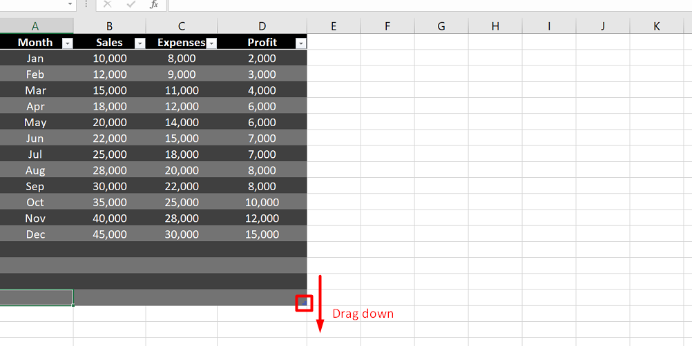
Each new column gets a generic heading that you can change later.
- You can also shrink the table by dragging the table sizing handle up or to the left. Any data currently in those cells remains but loses its table formatting.
- You can refer to a table by using its name, which you can define in the Table Name box on the Design tab. The range defined by this name automatically expands when you add rows or columns to the table.
When you use data from rows or columns in a table to define data series, labels, or other elements in a chart, those elements are automatically updated when you expand the table.
With these simple steps, you can easily expand or shrink your table in Excel to suit your needs.
FAQs
How do I organize data in a table in Excel?
To organize data in a table in Excel, you can select the data range, go to the "Insert" tab, and choose the "Table" option to convert the data into a structured table format with filtering and sorting capabilities.
How does Excel help organize data?
Excel helps organize data by providing features like sorting, filtering, conditional formatting, data validation, and the ability to create tables and named ranges, allowing for efficient data management and organization.
Is Excel typically used to organize data and perform analysis?
Excel is widely used to organize data and perform analysis due to its versatile data manipulation capabilities, formula functions, charts, and pivot tables.
Why is Excel the best data analysis tool?
Excel is considered one of the best data analysis tools due to its user-friendly interface, wide range of built-in functions, ability to handle large datasets, powerful charting and visualization options, and compatibility with other data analysis software.
What are the Excel functions used in analyzing data?
Excel provides various functions for analyzing data, including SUM, AVERAGE, COUNT, MIN, MAX, IF, VLOOKUP, INDEX, MATCH, SUMIF, COUNTIF, and statistical functions like STDEV, CORREL, and AVERAGEIF, among others.
Final Thoughts
Excel tables are a fantastic way to organize and analyze data quickly and easily. They make sorting, filtering, and calculating your information simple without using complicated formulas or functions.
Tables also allow you to add new data easily without worrying about formulas or formatting. Plus, they make it easy to create charts and graphs based on your data, which can help you better understand what it means.
Finally, with some practice and exploration, you'll find that Excel tables can be a powerful tool for making sense of even the most complex data sets.
One more thing
If you have a second, please share this article on your socials; someone else may benefit too.
Subscribe to our newsletter and be the first to read our future articles, reviews, and blog posts in your email inbox. We also offer deals, promotions, and updates on our products and share them via email. You won’t miss one.