In this beginner's guide, we will walk you through how to create histograms in Excel.
This article will provide step-by-step instructions on creating a histogram in Excel, including tips for formatting your chart to make it more visually appealing and effective.
Let's dive in and explore the world of histograms in Excel!
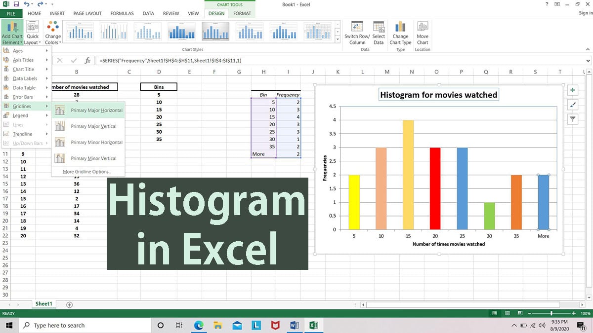
Table of Contents
- Excel Histograms: What Are They and How to Use Them
- Creating Histograms in Excel
- Advantages of Histograms in Data Analysis
- Understanding Bins and Edges in Histograms
- Mistakes to Avoid When Creating Histograms
- Differences between Histograms and Other Types of Charts
- FAQs
- Final Thoughts
Summary: Create a histogram in Excel
- Make sure you load the Analysis ToolPakto add the Data Analysis command to the Data tab.
- On a worksheet, type the input data in one column, and the bin numbers in ascending order in another column.
- Click Data > Data Analysis > Histogram > OK.
Excel Histograms: What Are They and How to Use Them
A histogram is a chart that helps you see how often something occurs in a certain range. Think of it like a bar chart, where each bar represents how often something happens within a certain group.
A histogram is useful when you have a lot of data because it lets you see patterns that might otherwise be obvious. It helps you group your data into different categories, making it easier to understand.
Let's say you're a store manager and want to see how many items of clothing you sell in different price ranges. You could use a histogram to group your sales data into different price ranges, like $10-$20, $21-$30, and so on.
This would help you see which price ranges are the most popular with your customers.
Another example could be tracking employees' hours on different tasks. You could use a histogram to group the data into different time intervals, like 0-2 hours, 2-4 hours, etc.
This helps you identify which tasks take up the most time and where you could make changes to increase efficiency.
Histograms are a great tool for analyzing data and identifying patterns. With some Excel know-how, you can easily create histograms to help you make sense of your data and make informed decisions.
Creating Histograms in Excel
Creating a histogram in Excel is an easy way to show data distribution in a visual format. You can use it to group data into different categories or ranges and then show how many data points fall within each category.
To create a histogram in Excel:
- Select the data that you want to use for your histogram.
- Go to the Insert tab on the Excel ribbon and click the Insert Statistic Chart button.
- From the drop-down menu, select the Histogram option.
-
Excel will create a histogram chart for you based on your selected data. By default, Excel will group your data into "bins" of equal size, but you can adjust the bin size and number to fit your specific needs.
- You can also customize your histogram chart by adding titles, labels, and other formatting options to make it more visually appealing and easier to understand.
Histograms are a great way to visualize data and help you understand its distribution.
Creating a histogram in Excel allows you to quickly and easily see patterns and trends in your data that might not be immediately obvious from a simple table or list.
Advantages of Histograms in Data Analysis
Histograms are a useful tool for analyzing data. They are used to show the distribution of numerical data in a simple and easy-to-understand way.
Histograms can be used for small and large data sets, making them ideal for analyzing data with more than 100 observations.
One advantage of using histograms is that they can quickly detect any outliers or gaps in the data. Outliers are data points much larger or smaller than the other data points in the set.
These can indicate data collection or analysis errors and may require further investigation. Gaps in the data, on the other hand, can indicate missing or incomplete data.
Another advantage of histograms is that they are easy to read and interpret. They allow us to quickly see the distribution of data and identify any patterns or trends that may be present.
This can be useful when making decisions based on the data, such as:
- Identifying areas for improvement in a business
- Identifying trends in scientific research
Understanding Bins and Edges in Histograms
In a histogram, data is divided into intervals or "bins," and the number of observations falling into each bin is counted. These bins can be considered categories or groups into which the data is divided.
The width of each bin determines the range of data that falls into that category.
Edges, also known as boundaries, define the limits of each bin. The lower edge is the minimum value of the range, and the upper edge is the maximum value of the range.
The edges of the bins are important because they define the range of values included in each bin, which determines the shape of the histogram.
By adjusting the bins' width and the edges' position, we can control the level of detail and accuracy in the histogram. If the bins are narrow enough, we may notice important data features.
On the other hand, if the bins are narrow enough, we may introduce noise and make it easier to see the overall pattern.
Mistakes to Avoid When Creating Histograms
Histograms are great tools for analyzing data but can also be misleading if not created correctly. Here are some common mistakes to avoid when creating histograms:
- Sorting individual data: Histograms are meant to show the frequency distribution of a dataset, not the order of the individual data points. It is important to group the data into bins and plot the frequency of each bin.
- Using individual data instead of subgroups: Histograms are meant to show the distribution of a data subgroup, not the entire population. Subgroups should be defined based on a specific criterion, such as time, location, or product.
- Using the wrong formulas: There are different formulas in creating histograms, and it is important to choose the correct one based on the type being analyzed.
For example, the Cp and Cpk formulas are used for process capability analysis, while the Pp and Ppk formulas are used for process performance analysis.
By avoiding these common mistakes, you can ensure that your histograms accurately represent the data and provide valuable insights for analysis.
Differences between Histograms and Other Types of Charts
Histograms are a type of chart that show numerical data, meaning data with numbers. They are different from other charts, like bar charts, which are used for categorical data or data that is sorted into categories.
Histograms are good for showing continuous data, which means they can have an infinite number of values. Trying to show all the possible values of continuous data on a chart can be hard, so histograms group the data into ranges or bins.
For example:
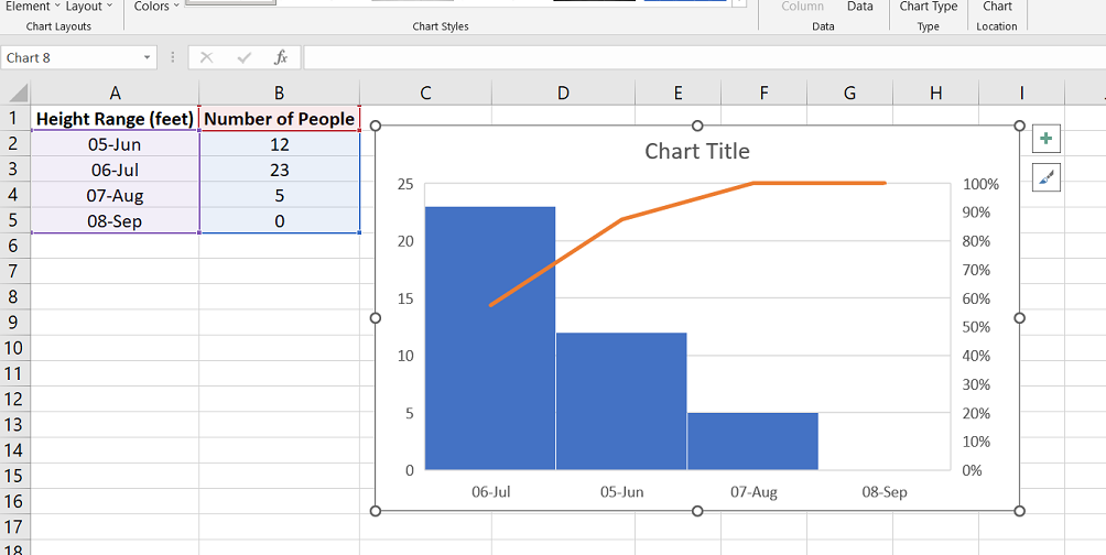
If we had data on the heights of a group of people, we could use a histogram to show how many people were in each height range, like 5-6 feet, 6-7 feet, and so on. This helps us see the overall pattern in the data.
Other charts, like line graphs or scatter plots, can also show patterns in data, but they are used for different types of data or to show different things.
FAQs
Can Excel be used to create a histogram?
Yes, Excel can be used to create a histogram by utilizing the built-in charting features and data analysis tools.
How to do a histogram step by step?
To create a histogram in Excel, you need to organize your data, select the data range, go to the "Insert" tab, choose the "Histogram" chart type, and customize the chart as needed.
What are the 3 steps in making a histogram?
The three steps in making a histogram are: 1) organizing the data into intervals or bins, 2) counting the frequency or occurrence of data within each bin, and 3) creating a chart or graph to visualize the distribution of the data.
What are the basics of histograms?
Histograms are graphical representations of the distribution of data, displaying the frequency or occurrence of data within predefined intervals or bins along the x-axis and the count or frequency on the y-axis.
What is the first step in creating a histogram?
The first step in creating a histogram is to organize the data into intervals or bins, which define the ranges in which the data will be grouped or categorized.
Final Thoughts
Histograms are powerful tools for data visualization that allow us to explore the distribution of our data quickly and easily. With Excel, creating histograms is simple and can be done in a few easy steps.
By selecting the data and choosing the appropriate chart type, we can generate a histogram that provides insights into the underlying patterns in our data. It's important to avoid common mistakes, such as using the wrong formulas and sorting individual data.
By understanding how histograms work and how to use them effectively, we can make more informed decisions and draw meaningful conclusions from our data.