

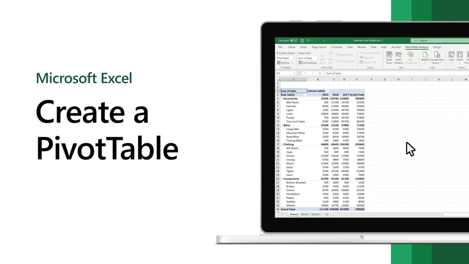
Pivot tables are a powerful tool in Excel that allows users to summarize and analyze large data sets quickly and efficiently.
In this ultimate guide, we will take you through the ins and outs of pivot tables, from the basics to the more advanced features.
Whether you're a beginner or an advanced Excel user, this guide will provide the knowledge and skills you need to take your data analysis to the next level.
Table of Contents
- What are Pivot Tables and Why Use Them?
- 4 Simple Steps to Create a Pivot Table in Excel
- How to Sort a Pivot Table by Values
- Sorting Pivot Tables
- How to Use Conditional Formatting in Pivot Tables
- Pivot Table Filters
- Using Pivot Table Slicers to Filter Data Interactively in Excel
- VIDEO Office 2021: Learn Excel Pivot Tables in 3 Minutes!
- FAQs
- Final Thoughts
What are Pivot Tables and Why Use Them?
Have you ever had to look at a big list of numbers and didn't know where to start? That's where pivot tables come in! Pivot tables are a fancy way of looking at data that helps you find what you need quickly.
Think of pivot tables like a giant map that shows you where all the important things are. You can move things around and change their appearance until you find what you need.
You can even make graphs and charts to help you understand the data better.
Pivot tables are built into an Excel program, like a super calculator for your computer. Excel lets you put in lots of numbers and do all kinds of things with them. With pivot tables, you can tell Excel exactly what you want to see, and it will show it to you in an easy-to-read way.
So, why use pivot tables? Because they can save you lots of time! Instead of looking through pages and pages of data, pivot tables let you find what you need quickly and easily.
Plus, once you get the hang of using pivot tables, you'll be able to understand your data better and make smarter decisions based on it.
4 Simple Steps to Create a Pivot Table in Excel
They’re a powerful tool that can help you understand large data sets. The best part? You can create one in just five simple steps!
- You need to make sure your data is good. That means ensuring all your headers are correct, your data is accurate, and there are no blank rows or duplicates. If your data is messy, your pivot table won’t be helpful.
-
Click on the PivotTable command. This will create a dialog box where you can choose where to place your pivot table and whether to include multiple tables.
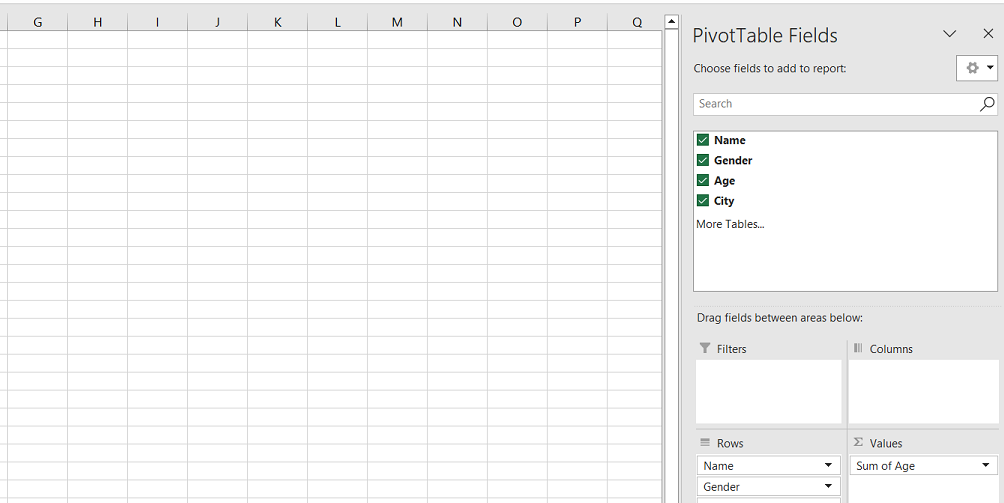
- You can start summarizing your data. You can summarize your data by adding headers to the Rows or Columns area.
- You can analyze your data and change your pivot table. It’s easy to add or remove fields, change how your data is summarized, and more.
How to Sort a Pivot Table by Values
Sorting data can make it easier to find what you're looking for. For example, you can sort data alphabetically, numerically, or by date. Sorting a pivot table by values is a quick and easy way to organize large amounts of data.
Here's how to sort a pivot table by its values:
- Right-click on a value in the column you want to sort.
- Choose the "Sort" option from the menu that appears.
-
Select "Sort Largest to Smallest" from the dropdown menu.
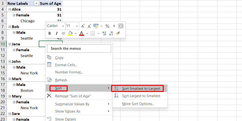
Once you've sorted your pivot table, the rows will be arranged from highest to lowest value. This makes it easy to see which data points are the most important.
In our example, we sorted our table by the number of email addresses for each city. This makes it easy to see which cities have the most subscribers.
By sorting data in a pivot table, you can quickly get insights into your data and make better decisions.
Sorting Pivot Tables
Sorting a pivot table by totals can help you quickly see which columns have the largest or smallest values.
To do this:
- Right-click the subtotal or grand total row and select "Sort" from the menu.
- Choose the order in which you want to sort the columns.
For example:
If you want to see which columns have the highest and lowest values, you can sort the total row from largest to smallest.
This will rearrange the columns based on their totals, so the column with the highest total will be on the left, and the column with the lowest total will be on the right.
By sorting by totals, you can quickly see which columns have the most or least data. This can be helpful when you are trying to analyze a large data set and need to find patterns or trends.
How to Use Conditional Formatting in Pivot Tables
Have you ever wanted to change the color of a cell in Excel when it meets a certain condition? This is called conditional formatting, which can help make your data easier to understand. Using conditional formatting in pivot tables is just as easy as using it with any other data set in Excel.
Here’s how:
- Select the cells you want to analyze in your pivot table.
- Go to the Home tab at the top of Excel.
-
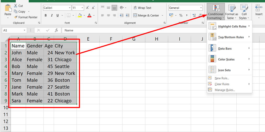
- Choose the action you want to perform, such as changing the cell color.
- Select the rule to apply, such as highlighting cells with a certain value.
-
If no built-in rules are suitable, you can create your own rule by clicking “New Rule….”
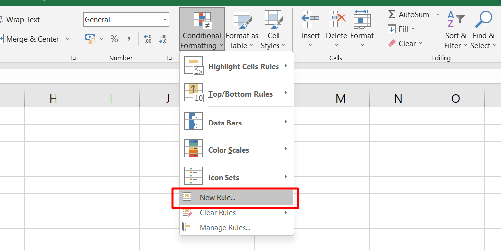
Once you’ve applied conditional formatting to your pivot table, you can quickly identify important information based on your chosen colors. It’s a simple but powerful way to make your data more readable and useful.
Pivot Table Filters
Pivot table filters are a helpful way to show only a specific set of data. There are different ways to filter data in a pivot table.
-
Apply Manually: This way of filtering temporarily hides certain data from the report.
To do this:
- Select the filter drop-down arrow in the header row for the column you want to filter.
- Uncheck "Select All" and choose the values you want to display. The pivot table will show only the rows where the selected values appear in the filtered list.
- Using the Filters Area: This is another way to filter data in a pivot table. You can find the Filters area in the PivotTable Fields pane. You can drag and drop fields into the Filters area to add filters. You can then select the filter drop-down arrow in the pivot table and choose the values you want to display.
- Slicer: This is another useful filter that needs to be noticed. A slicer is like a visual filter that you can use to show only a specific data set. You can create a slicer by selecting the pivot table and then going to the Analyze tab. From there, choose the Insert Slicer command and select the field you want to filter. You can then click on the slicer to show only the data you want to see.
Using Pivot Table Slicers to Filter Data Interactively in Excel
Pivot table slicers are a cool tool in Excel that help you filter and display data more interactively. They work similarly to filters but are more fun to use.
Here’s how to add a slicer to your pivot table:
- Click inside the pivot table if you want to add a slicer.
- Go to the Insert tab and click “Slicer” in the Filters command group.
-
Choose the category or categories containing the values you want to be able to hide or display.
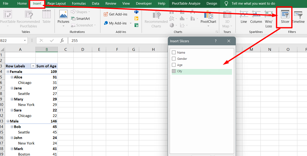
- Resize or move the slicer(s) to a location where you can easily view and manage your pivot table(s).
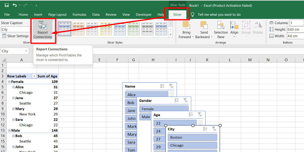
Slicers are not just pretty faces. They can save you time too. By linking a slicer to multiple pivot tables, you can control the display of multiple pivot tables simultaneously.
Here’s how to link a slicer to multiple pivot tables:
- Make sure each pivot table was created using the same source data.
- Add the slicer for the first pivot table.
-
Click the slicer and go to the Slicer tab > Report Connections.
-
Select the reports to be linked to that slicer. Click OK.
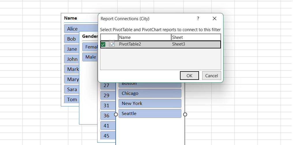
With slicers, you can quickly and easily see the data you want to see and hide the data you don’t want to see.
Office 2021: Learn Excel Pivot Tables in 3 Minutes!
PIVOT Table FAQs
How do I create a master pivot table in Excel?
To create a master pivot table in Excel, you can consolidate multiple data sources by selecting "PivotTable" from the "Insert" tab, specifying the range and data sources, and organizing the fields to analyze the data collectively.
What are the benefits of using pivot tables to manage your data?
Using pivot tables to manage data provides benefits such as easy data summarization, quick data analysis, the ability to create interactive reports, identifying trends and patterns, and simplifying complex datasets.
How can I improve my pivot table?
You can improve your pivot table by ensuring your source data is organized and formatted correctly, selecting relevant fields for analysis, utilizing filters and slicers, and exploring advanced features like calculated fields and custom sorting.
How can I improve my Excel table?
To improve your Excel table, you can consider formatting the data as a table, applying appropriate column formatting, using data validation for data entry, adding formulas and functions, and using conditional formatting for visual cues.
Is it hard to learn pivot tables in Excel?
Learning pivot tables in Excel may initially require some effort, but with practice and familiarity, they can be easily understood and provide powerful data analysis capabilities even for users with basic Excel knowledge.
Final Thoughts
Pivot tables are a powerful tool that can help you quickly analyze and visualize complex data sets in Excel.
With the ability to sort, filter, and manipulate data in various ways, pivot tables can provide valuable insights into your data.
By mastering pivot tables, you can become a more efficient and effective Excel user, making extracting the information you need to make informed decisions easier.
One more thing
If you have a second, please share this article on your socials; someone else may benefit too.
Subscribe to our newsletter and be the first to read our future articles, reviews, and blog post right in your email inbox. We also offer deals, promotions, and updates on our products and share them via email. You won’t miss one.
Related articles
»10 Steps to Make a Pivot Chart in Excel
» How to Limit Rows and Columns in an Excel Worksheet
» Troubleshooting "OLE Action Excel" Error in Microsoft Excel
» Ways To Alternate Row Colors in Excel [Guide]