As PowerPoint is all about creativity, there are endless possibilities in how you create your presentations. However, this often leads to overchoice — a difficult time making decisions when faced with many options. This guide will help you overcome this obstacle. Our tips won’t restrict your creativity. They’ll guide you to make the right choices for your presentation.
Before we dive into the PowerPoint tips, let’s go over some of the core rules about PowerPoint presentations:
- Always prepare: Don’t start to work on the visuals of your presentation right away, and instead put the first few hours into researching your topics.
- Know your audience: Are you preparing for a business presentation? Is it a project for college? Or are you presenting for children? Always know who your audience will be so you can create your presentation with a better understanding of their needs.
- Less is more: You’ll hear this saying a lot when researching about PowerPoint. Don’t clutter your slides with unnecessary elements, too much text, or overwhelming animations.
- Practice, practice, practice: Even if you craft the best presentation ever, you need to present it accurately to engage your audience. The only way you can do this is by practicing first.
Now that you know and understand these rules let’s move on to learning some tips and improving your presentation.
1. Limit the words on your slides
When making your slides, remember the famous phrase “less is more” mentioned in the introduction. Simplicity is superior when you’re making a presentation. You should always try to highlight only key points with text. Fill in the gaps verbally while presenting or by attaching images and graphs.
Cluttered slides make it hard for your audience to focus. What makes your slides digestible is the way you space out information. Don’t be afraid to utilize white space; you don’t have to fill out every nook and cranny on your page.
2. Use high-quality images
After reducing the amount of text in your presentation, it’s time to add pictures to illustrate your limited amount of words. When doing this, pay attention to the quality of your chosen images. Most of the time, your slides will be shown in large as you present in front of the audience. The flaws of low-quality images become impossible to miss in this scenario.
Let’s look at an example:

This is a bad quality image, saved in the .jpeg format. Images like this look unappealing and will reduce the overall quality of your presentation.

The same image in much better quality leaves a better impression. The details are crisp and easy to digest for your viewers, leaving a lasting impact on them.
There are a few websites I personally use when looking for images in high-quality. If you need something for free with no credit required, I recommend Pexels. You can find some serious gems in their user-generated selection of images.
Adobe Stock is a paid service. However, it offers the largest variety of top-tier imagery. First-time users also get to download and use 10 images for free. If you choose smart, this is more than enough to cover your presentation in wonderful images.
3. Pick the right fonts for your audience
Don’t underestimate the power of the right typeface. Sure, you might be tempted to type everything up in a default font and not really worry about the rest. However, this might damage your final presentation in the end.
Choosing the right fonts (yes, plural) help you leave a better impression when you present in front of the audience. This is where knowing your audience comes into play. Pick your fonts depending on who you’re presenting for, what the topic is, and the tone you picked for the presentation.

One mistake I see people make regarding fonts is choosing something that’s not appropriate for their presentation. The graphic above should give you a reference point for how to choose your fonts. Most of the time, you should also refrain from picking fonts that are hard to read, too eccentric, or over the top.
Using only one font throughout the entirety of a presentation isn’t recommended. On the other hand, picking too many different fonts is also going to be damaging to the look of your project. I normally stick to choosing a different font for my headers and body text. Make sure the two fonts go well together and aren’t vastly different from one another.
4. Don’t forget about shapes
PowerPoint has a large variety of built-in shapes for you to work with. Better yet, you can edit and customize these shapes! This is personally one of the things I love about PowerPoint — no limits to your creativity.
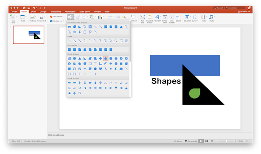
Shapes can be found in the Insert menu from the Ribbon header. There are tons of different shapes for you to choose from, including rectangles, circles, lines, and much more. You can also find advanced shapes like ribbons, stars, flowcharts, emoticons… the list goes on.
You’re also able to change the color and outline of a shape or even add an image to the shape. With this, you can create some pretty interesting slides and backgrounds.
5. Work with complementary colors
When designing the look of your slides, choose colors that go well together. Make sure that the colors you pick have high contrast with each other — for example, use a dark color for text if your background is bright and vice versa.
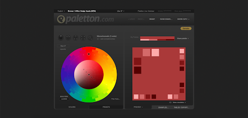
I personally use Paletton to test my colors out before rolling them in a presentation. What I like about this website is the fact that I can test out multiple combinations at once, reducing the time spent experimenting and allowing me to focus more on the presentation itself.
6. Utilize bullet points properly
Let me tell you right off the bat: bullet points are extremely effective in PowerPoint presentations. Use them.
But use them wisely. Always make sure that your bullet points are kept short and simple, to the point. You should treat them as guides, and elaborate in speech as you’re presenting to your audience.
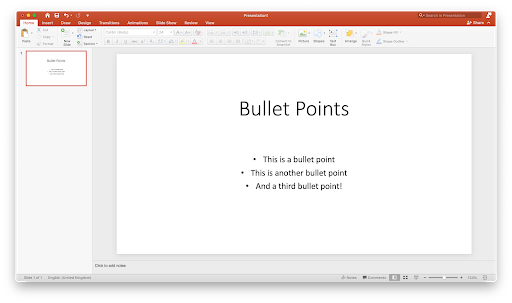
Another thing to pay attention to is how you display these bullet points. Make sure to animate your elements, so only one bullet point is shown at a time. Overwhelming your audience with all the points will only lead to them losing focus on the points individually.
7. Memorize the 2/4/8 rule
There’s a handy little rule I like to utilize when I work on my presentations, called the 2/4/8 rule. Just like a recipe, this rule will make your presentation better not only when you’re creating it, but when you’re presenting it as well.
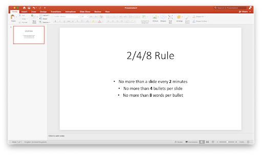
The 2/4/8 rule is as follows: About every 2 minutes, have a new slide—no more than 4 bullets per slide, and no more than 8 words per bullet.
Final thoughts
We hope that this article was able to help you learn more about PowerPoint and the power it can give your presentation. Return to our page anytime you need further guidance regarding Microsoft’s presentation builder app.
If you want to read more modern technology articles, consider subscribing to our newsletter. We regularly publish tutorials, news articles, and guides to help you in your day-to-day tech life.
Also Read
> Microsoft Office PowerPoint cheat sheet
> What is the PowerPoint Design Ideas Tool and How to Use it
> Top 10 PowerPoint Tips and Hacks You Need to Know
> How To Create Your Own Custom Templates in PowerPoint