

Excel's popularity stems from its extensive features and functions, empowering analysts to clean, aggregate, pivot, and visualize data seamlessly. In this article, we will explore Excel's top 10 essential features and functions for data analysis.
Table of Contents
- Pivot tables and pivot charts
- Conditional formatting
- Remove duplicates
- XLOOKUP
- IFERROR function
- Load and Activate Analysis Toolpak
- Anova
- Correlation
- Covariance
- Descriptive Statistics
- FAQs
- Final Thoughts
Pivot tables and pivot charts
Pivot tables and pivot charts are powerful tools in Excel that allow analysts to transform and visualize data effortlessly. A pivot table reorganizes columns and rows, enabling easy grouping, summarization, and statistical analysis. To create a pivot table and chart:
- Select the data range and enter Insert
-
PivotChart > PivotChart & PivotTable.
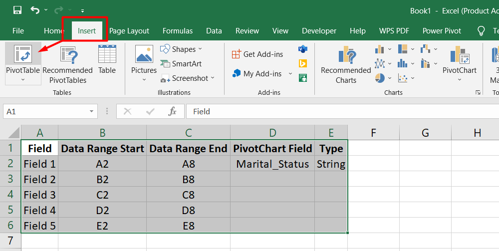
Once the Create PivotTable editor appears, the selected range will automatically fill the Table/Range field. Clicking OK generates the pivot table. In the PivotChart Fields, drag the desired field (e.g., Marital_Status) into the Axis (Categories) box and Values box. If the data type is a string, the aggregation defaults to Count; if it's numeric, the default is Sum.
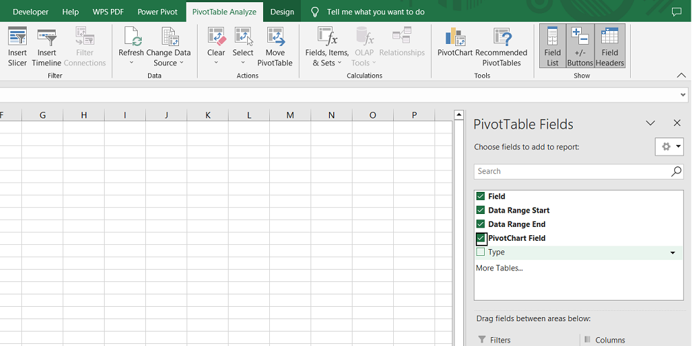
The pivot table and chart populate with just a few clicks, visually representing the data. Additional dimensions or filters can be added by dragging new fields into the corresponding boxes. This simplicity and versatility make pivot tables and charts widely favored for data aggregation and visualization in Excel.
Advantages of pivot tables and charts:
- Simplify data analysis: Transforming raw data into a summarized format becomes effortless.
- Quick insights: Visualizing data through charts allows for easily identifying patterns, trends, and outliers.
- Flexible customization: Fields can be easily added, removed, or rearranged to tailor the analysis.
- Interactive exploration: Pivot charts allow users to filter and drill down into specific data subsets for deeper analysis.
- Automatic updates: When the underlying data changes, pivot tables and charts can be refreshed to reflect the updated information.
Conditional formatting
Conditional formatting is a highly useful feature in Excel that allows you to highlight or hide cells based on specified rules dynamically. It is an effective tool for identifying outliers, duplicates, or patterns within your data. With conditional formatting, you can apply rules to single or multiple cells in the same worksheet.
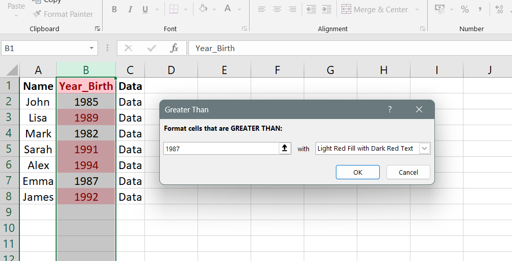
To illustrate, we want to highlight all values in the "Year_Birth" column that are greater than 1987.
- Select the column.
- Go to Conditional Formatting.
-
Highlight Cells Rules > Greater Than, and the rule editor will appear.
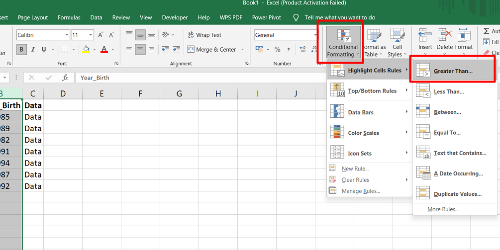
-
Enter the value 1987 and click OK. The cells in the column with values exceeding 1987 will be highlighted light red.
If you need to adjust or modify the conditional formatting rule you created, you can access the Conditional Formatting Rules Manager through Conditional Formatting > Conditional Formatting Rules Manager. This manager allows you to edit existing rules or create new ones. It's even possible to have multiple rules affecting different aspects of the spreadsheet.
Remove duplicates
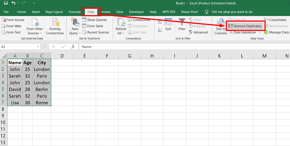
Data often contains duplicates, which can hinder accurate analysis. Excel provides a convenient feature to remove duplicates and streamline your data. Before deleting duplicates, you can use conditional formatting to highlight them for review. Go to Data > Data Tools > Remove Duplicates to access the Remove Duplicates feature.
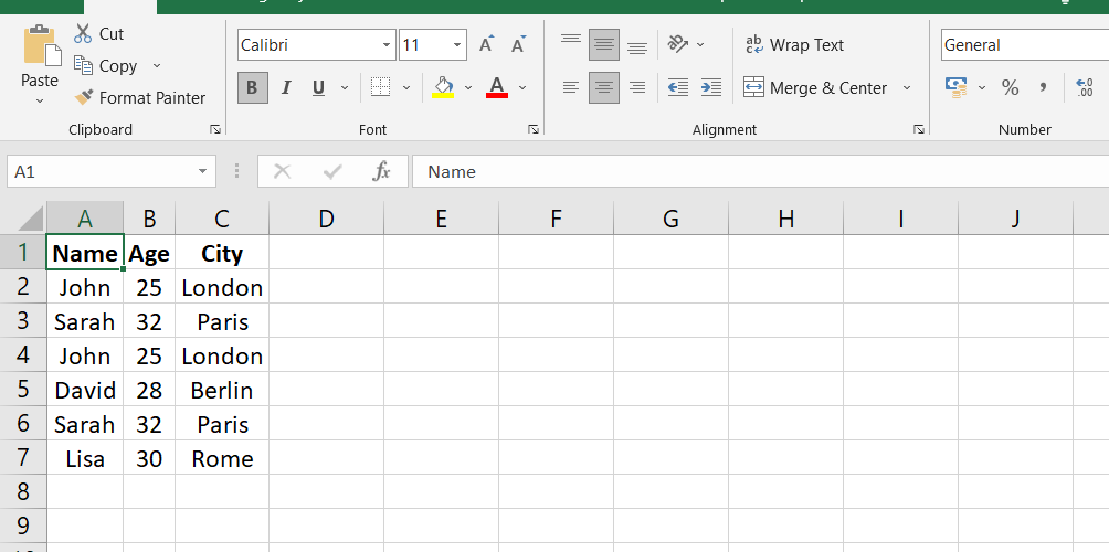
In this example, we have a dataset with three columns: Name, Age, and City. The table contains six rows of data, including some duplicate entries.
To remove duplicates, you would follow the steps mentioned earlier. After selecting the dataset, you would go to Data > Data Tools > Remove Duplicates.
The Remove Duplicates editor would appear, allowing you to choose the columns to consider when identifying duplicates. In this case, you might select all three columns: Name, Age, and City. You would also make sure that the "My data has headers" checkbox is selected.
After configuring the settings, you would click OK. Excel would eliminate the duplicate entries, and a message would indicate the number of unique values in the dataset. In this example, after removing duplicates, the table would look like this:
As you can see, the duplicate entries for John and Sarah have been removed, resulting in a dataset with four unique values.
XLOOKUP
XLOOKUP is a versatile function in Excel that combines the functionality of VLOOKUP and HLOOKUP. It allows you to search for a value in a range, whether vertically or horizontally, and retrieve a corresponding result. The syntax for the XLOOKUP function is as follows:
=XLOOKUP(lookup_value, lookup_array, return_array, [if_not_found], [match_mode], [search_mode])
To illustrate, let's consider an example where we want to find the Year_Birth based on an entered ID value. In cell AD2, enter the ID value (e.g., 8755), and in cell AE2, enter the XLOOKUP formula:
=XLOOKUP(
The lookup_value is the value we want to search for, so we reference AD2.
The lookup_array is the column or row that contains the lookup values, so we select A2:A2241 to get an array of IDs.
The return_array is the column or row that contains the values we want to retrieve, so we select B2:B2241 to obtain Year_Birth values.
The completed formula will look like this: =XLOOKUP(AD2, A2:A2241, B2:B2241)
Once you enter different IDs, the corresponding Year_Birth values will be returned. XLOOKUP is a powerful tool that can be further utilized by joining data from different sheets or nesting lookup functions within each other, allowing for complex calculations such as summing the values of multiple lookups.
IFERROR function
The IFERROR function in Excel allows you to handle errors within a formula by providing a custom error message or alternative value. Its syntax is straightforward:
=IFERROR(value, value_if_error)
In the context of the XLOOKUP function, if the ID entered in cell AD2 is not found in the lookup array, cell AE2 would display the #N/A error. We can use the IFERROR function to wrap the XLOOKUP function to provide a more meaningful message. The formula would look like this:
=IFERROR(XLOOKUP(AD2, A2:A2241, B2:B2241), "ID Not Found")
With this formula, if the XLOOKUP function encounters an error (e.g., ID not found), it will display the specified custom message "ID Not Found" in cell AE2.
Instead of a text message, you can also use another cell as the value_if_error. If you reference a blank cell as the value, it will display 0 in the cell where the error occurs.
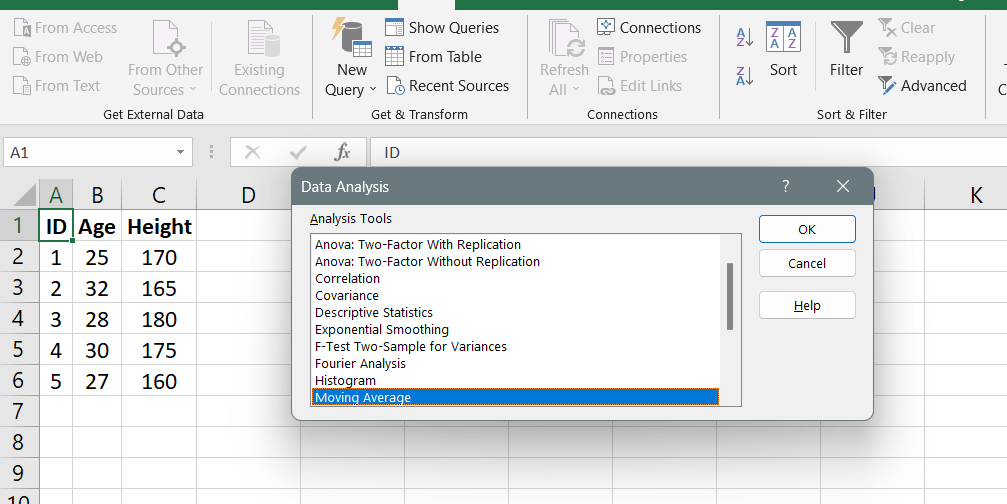
Load and Activate Analysis Toolpak
The Analysis ToolPak is a powerful Excel add-in allowing you to perform complex statistical or engineering analyses easily. By using this tool, you can save time and simplify the process of data analysis. The ToolPak utilizes a range of statistical and engineering macro functions to calculate and display results in output tables, and it can even generate charts.
To access the Analysis ToolPak:
- Go to the Data tab.
-
Click on the Data Analysis button in the Analysis group.
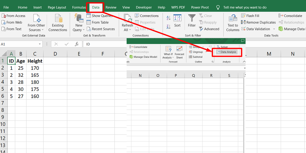
If you don't see the Data Analysis command, you must load the Analysis ToolPak add-in program.
To load and activate the Analysis ToolPak, follow these steps:
- Click on the File tab, select Options, and go to the Add-Ins category.
- In the Manage box, choose Excel Add-ins and click the Go button.
- For Excel on Mac, go to the Tools menu, and select Excel Add-ins.
- Check the Analysis ToolPak checkbox in the Add-Ins box, and click OK.
- If you don't see the Analysis ToolPak listed, click Browse to locate it.
- If prompted, click Yes to install the Analysis ToolPak if it is not currently installed on your computer.
Note: If you want to include Visual Basic for Application (VBA) functions for the Analysis ToolPak, you can also load the Analysis ToolPak - VBA Add-in like the Analysis ToolPak.
Anova
The Anova analysis tools in Excel provide different types of variance analysis for comparing multiple samples or factors. The specific tool you should use depends on the number of factors and samples you have.
- Anova: Single Factor: This tool is used when you have data for two or more samples and want to test the hypothesis that they are drawn from the same underlying probability distribution. It compares the variances between the samples to determine if they are significantly different.
- Anova: Two-Factor with Replication: This tool is helpful when you have data classified along two dimensions, such as different fertilizer brands and temperature levels. It allows you to test the effects of each factor independently and also examines whether there are additional effects due to specific combinations of factors.
- Anova: Two-Factor Without Replication: Similar to the Two-Factor with Replication tool, this analysis is used when data is classified along two dimensions. However, it assumes that there is only one observation for each combination of factors, unlike the multiple observations in the replication case.
To perform an Anova analysis, you must set up your input range in Excel. This includes organizing your data in a specific format to ensure accurate analysis.
Correlation
You can use the CORREL or PEARSON functions in Excel to calculate the correlation coefficient between two measurement variables. These functions are useful when observing each variable from multiple subjects. The correlation coefficient measures the extent to which two variables vary together. The Correlation analysis tool in Excel is especially handy when you have more than two measurement variables for each subject.
The correlation analysis tool generates a correlation matrix showing the correlation coefficient between each pair of measurement variables. Unlike the covariance, the correlation coefficient is scaled to be independent of the units in which the variables are expressed. This means that converting the units of one variable does not change the value of the correlation coefficient.
The correlation coefficient can take values between -1 and +1, inclusive. A positive correlation indicates that large values of one variable are associated with large values of the other, while a negative correlation indicates that small values of one variable are associated with large values of the other. A correlation near 0 suggests that the variables are unrelated.
Covariance
In Excel, the Correlation and Covariance tools can be used to analyze sets of N measurement variables observed in a group of individuals. These tools provide output tables, or matrices, that display the correlation coefficient or covariance, respectively, between each pair of measurement variables.
The main difference between correlation and covariance is in their scaling. Correlation coefficients are scaled to range between -1 and +1, while covariances are not scaled. Both correlation and covariance measure the extent to which two variables "vary together" or are related.
The Covariance tool in Excel calculates the COVARIANCE.P value for each pair of measurement variables. If only two variables exist, you can use the COVARIANCE.P function directly. The diagonal entries in the Covariance tool's output table represent the covariance of each measurement variable with itself, which is equivalent to the population variance calculated using the VAR.P function.
Descriptive Statistics
The Descriptive Statistics analysis tool in Excel generates a comprehensive report of univariate statistics for a given data set. It provides valuable information about the central tendency and variability of the data, allowing you to understand and summarize its characteristics.
Here's what you need to know about the Descriptive Statistics tool:
- Central Tendency: The report includes measures that describe the center of the data distribution, such as the mean (average), median (middle value), and mode (most frequent value).
- Variability: The tool calculates various measures that indicate the spread or dispersion of the data, such as the range (difference between the maximum and minimum values), variance (average squared deviation from the mean), and standard deviation (square root of the variance).
- Distribution Shape: The tool also provides information about the shape of the data distribution, including skewness (asymmetry of the distribution) and kurtosis (peakedness or flatness of the distribution).
- Quartiles and Percentiles: The report includes quartiles (dividing the data into four equal parts) and percentiles (dividing the data into hundredths), which give insights into the data's distribution at different levels.
- Count and Missing Values: The tool counts the number of data points and identifies any missing values, ensuring you completely understand the dataset.
FAQs
Which tool is used for data analysis in Excel?
Excel provides various tools for data analysis, including functions, charts, PivotTables, and the Power Query and Power Pivot add-ins.
What are the data analysis functions of Excel?
Excel offers a wide range of data analysis functions such as SUM, AVERAGE, COUNT, MIN, MAX, IF, VLOOKUP, and many more, which allow you to perform calculations and manipulate data effectively.
Is Microsoft Excel data analysis?
Microsoft Excel is widely used for data analysis due to its comprehensive set of features, functions, and tools designed specifically for analyzing and interpreting data.
How do you perform data analysis?
To perform data analysis in Excel, you can start by organizing your data in a tabular format, applying appropriate functions and formulas, creating charts and graphs, utilizing PivotTables, and employing advanced tools like Power Query and Power Pivot for more complex analysis.
What is data analysis explain in detail?
Data analysis is the process of inspecting, cleansing, transforming, and modeling data to discover useful information, draw conclusions, and support decision-making. It involves various techniques such as statistical analysis, data visualization, data mining, and pattern recognition to uncover patterns, trends, and insights from the data.
Final Thoughts
In conclusion, Excel provides a powerful suite of tools for data analysis, making it a popular choice for professionals in various fields. With its features for data visualization, you can create compelling charts and graphs to represent your data visually.
Excel's data modeling capabilities allow you to organize and structure your data for advanced calculations and scenario analysis. The regression analysis tools in Excel enable you to identify relationships and make predictions based on your data.
Beyond these specific functions, Excel offers a wide range of additional analysis tools and functions to explore and analyze your data effectively. By leveraging Excel's data analysis capabilities, you can gain valuable insights, make informed decisions, and communicate your findings with clarity and impact.
One more thing
If you have a second, please share this article on your socials; someone else may benefit too.
Subscribe to our newsletter and be the first to read our future articles, reviews, and blog post right in your email inbox. We also offer deals, promotions, and updates on our products and share them via email. You won’t miss one.
Related articles
» Mastering Data Modeling in Excel: Advanced Techniques and Best Practices
» Beginner's Guide to Microsoft Excel Online: Manage Data & Create Spreadsheets
» Master Data Manipulation with Excel SUBSTITUTE Function: A Step-by-Step Guide