
We all know and love Excel charts. They don’t only make your documents look better and appealing but make it easier to understand your data. The visual representation created by a Pareto chart depicts which situations are more significant in a setting. It uses both bars and lines, creating a unique but insightful view of your data.
Do you want to know how to quickly insert a Pareto chart into your Microsoft Excel documents? Look no further — our guide streamlines the steps needed to create this powerful chart. Keep your seamless workload and integrate the use of Pareto charts into your Excel workbooks.
How to insert a Pareto chart on Excel
The steps below are written for Excel on Windows operating systems.
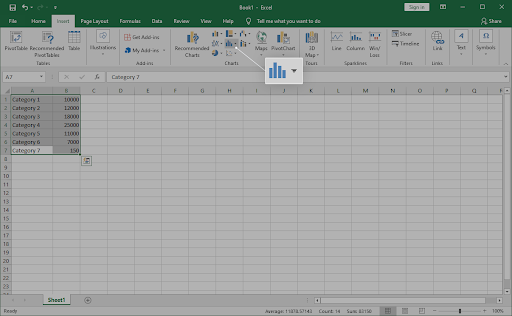
- Select the data you want to use for your Pareto chart. In most cases, you’d want to select a column containing categories and one containing numbers.
-
Switch to the Insert tab in your Ribbon interface, and then select Insert Statistic Chart.
-
A drop-down menu should appear. Under Histogram, pick Pareto as shown on the image below.
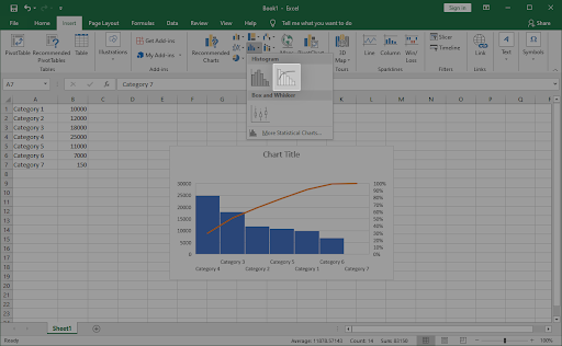
- The Pareto chart should immediately appear in your document. Select it, and then use the Design and Format tabs to customize how your chart looks.
How to insert a Pareto chart on Excel for Mac
Are you a macOS user? Don’t worry, we have you covered. The guide below focuses on how you can create and insert a Pareto chart on Excel for Mac. Let’s get right into it.
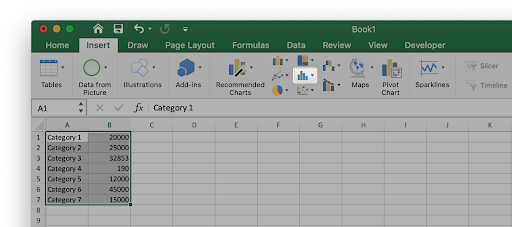
- Select the data you want to use for your Pareto chart. In most cases, you’d want to select a column containing categories and one containing numbers.
-
Switch to the Insert tab in your Ribbon interface, and then select Insert Statistic Chart.
-
A drop-down menu should appear. Under Histogram, pick Pareto as shown on the image below.
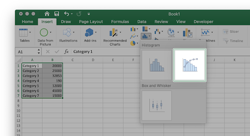
- The Pareto chart should immediately appear in your document. Select it, and then use the Design and Format tabs to customize how your chart looks.
Final thoughts
If you need any further help with Excel, don’t hesitate to reach out to our customer service team, available 24/7 to assist you. Return to us for more informative articles all related to productivity and modern-day technology!
Would you like to receive promotions, deals, and discounts to get our products for the best price? Don’t forget to subscribe to our newsletter by entering your email address below! Receive the latest technology news in your inbox and be the first to read our tips to become more productive.