In Excel, a frequency distribution table tells you how the data in your spreadsheet is distributed. This frequency distribution table is sometimes used in conjunction with a histogram to further visualize the data.

This article goes in-depth about how to use the frequency distribution function in Excel.
Frequency formula in Excel
In order to create an accurate frequency distribution table, you’ll need to use the FREQUENCY formula. This function has two arguments:
- Data array: Used to count the frequencies. If the data array values are zero, for example, Null values, then the frequency function will return an array of zero values.
- BIN array: Used to group the values in the data array. If the BIN array values are zero, then it will return the number of array elements from the data array.
You’ll need to use these array values in order to determine the frequency distribution of your data. Let’s continue with the process.
Create a frequency distribution table in Excel
Use our guide to learn the basics of creating a frequency distribution table in Microsoft Excel. The process is simple and beginner-friendly. Have any questions? Don’t hesitate to contact us.
For this example, we’ll create a distribution table using employee scores. Let’s get right into it.
- Open Microsoft Excel and select a workbook, or create a new one.
-
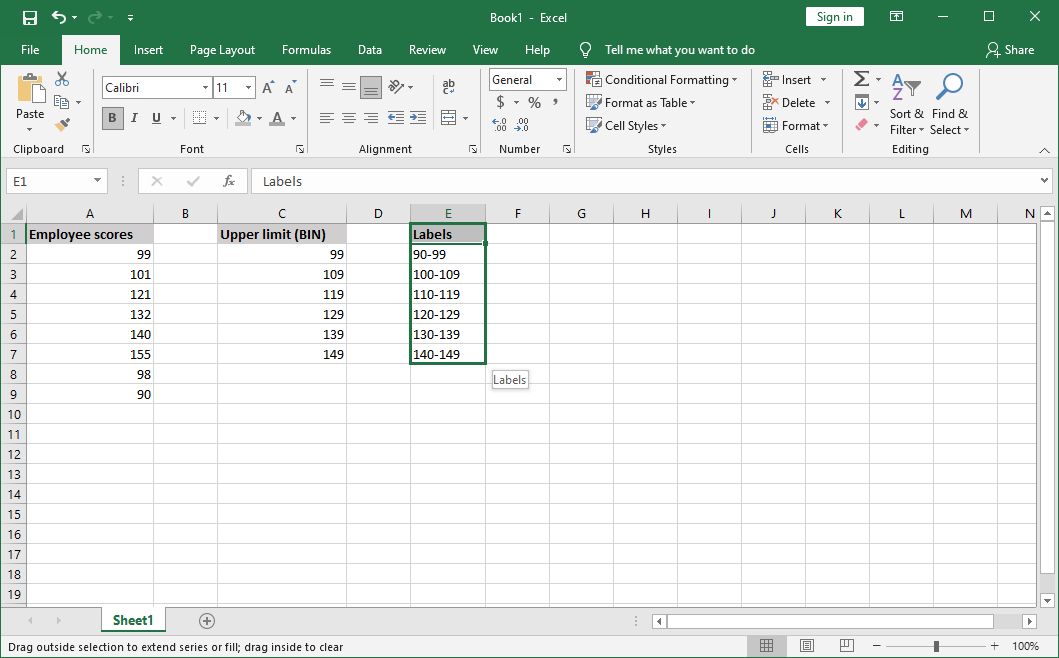
Make sure that there’s data present in your worksheet before continuing with the guide. Your data should be put into columns, with column headers. For example:

- Type the upper levels for your BINs into another column. These values should be specified in increasing order and correspond to non-overlapping numeric ranges.
-
Optionally, in a third column, create labels that specify which BINs the upper limits are for.
-
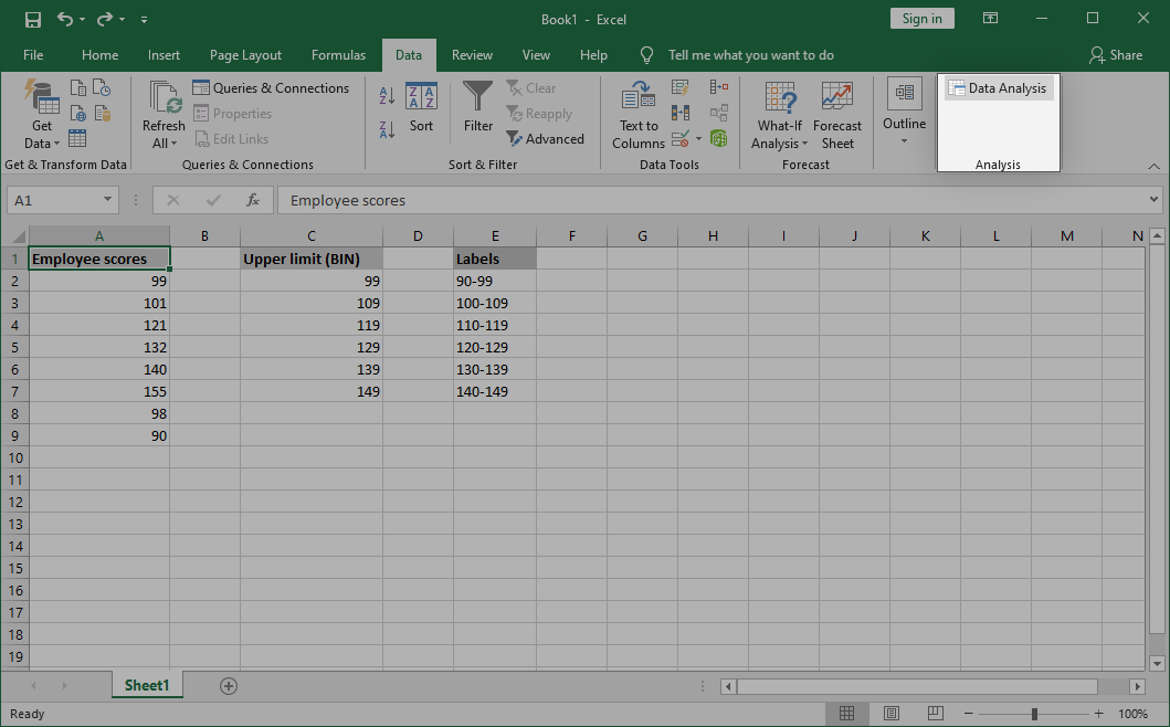
Switch to the Data tab in the ribbon header interface, and then click on Data Analysis from the Analysis group.
-
If you don’t have this option, navigate to File → Options → Add-ins and click on the Go button. Select Analysis ToolPak and click OK. The option should appear on your ribbon now.
-
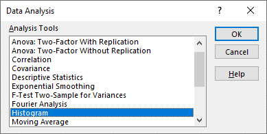
In the pop-up window, scroll down and select Histogram. Click the OK button to proceed.

-
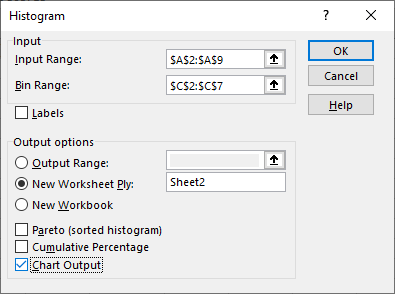
Fill in the required fields:
- In the Input range field, specify where your data is. For this example problem, we’ll type in $A$2:$A$9.
- Select your upper limits column in the BIN range field. For us, this would be $C$2:$C$7.
- Use the Output options section to select where you want the output to appear. You may pick an output range in the same worksheet, create a new worksheet, or an entirely new workbook.
-
Make sure to select Chart Output. When done, click OK. Excel will put the histogram chart next to your frequency table.
-
Done!
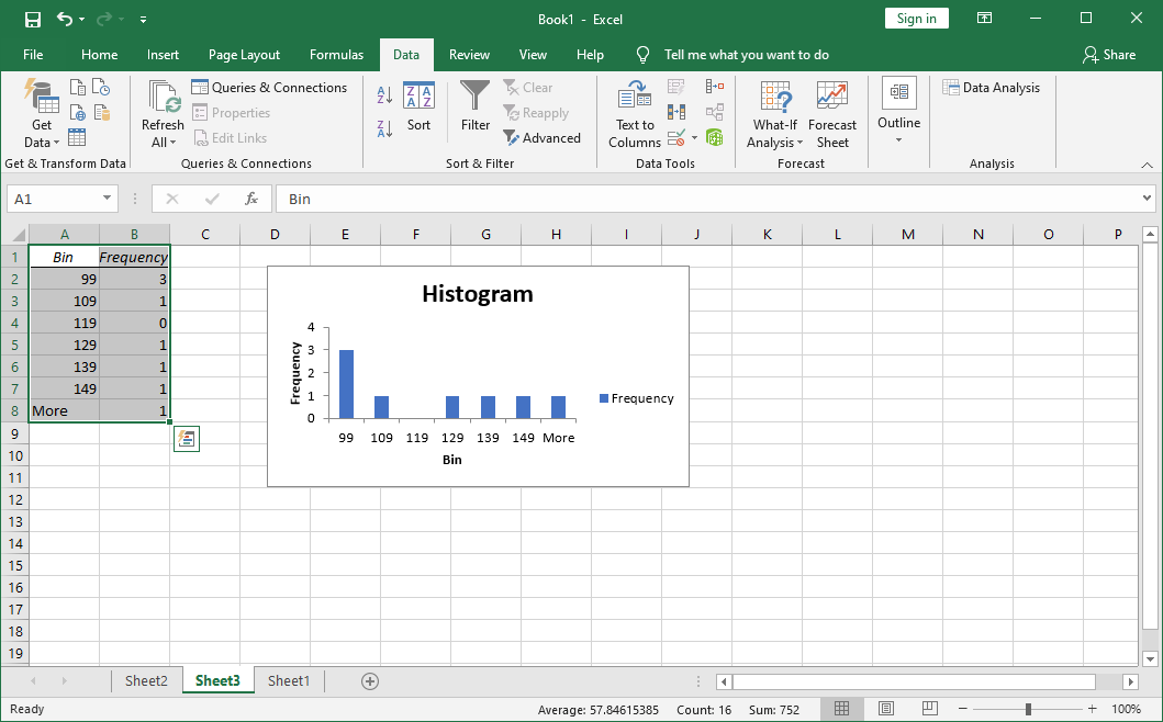
Bonus tip: It’s up to you how many BINs you have in your column, however, most tables stick to around 5 to 10. Ensure that your BINs include all of your lower values, as well as all of your upper values.
Final thoughts
If you enjoyed this article, please share it with your friends, colleagues, and family. Show them how to carry out frequency distribution in Excel. Return to us for more information articles on Excel functions.
One more thing
If you need any further help with Excel, don’t hesitate to reach out to our customer service team, available 24/7 to assist you. Return to us for more informative articles all related to productivity and modern-day technology!
Would you like to receive promotions, deals, and discounts to get our products for the best price? Don’t forget to subscribe to our newsletter by entering your email address below! Receive the latest technology news in your inbox and be the first to read our tips to become more productive.
You may also like
» How to Split Column in Excel
» How to Fix the Arrow Keys Not Working in Excel
» How to Insert Pdf into Excel